Explorations

Cloud Dancer: Pantone’s most controversial colour yet

Reading Time: 5 minutes

Why Pantone’s 2026 Colour of the Year is sparking global debate — and what we’re projecting onto it


Cloud Dancer, Pantone’s soft white chosen as the 2026 Colour of the Year, is perhaps the most controversial selection in the brand’s history. Critics have dismissed it as boring, tone-deaf, or racially insensitive — a stark contrast to Pantone’s stated message of peace and new beginnings. As the first white shade chosen in 26 years, it has sparked accusations of “rage bait” and drawn unsettling cultural parallels.

Yet for us — having opened an all-white boutique in 2006 —  this hue resonates deeply. It feels like home—a colour that never overpowered but elevated. 

So, let’s take a closer look.

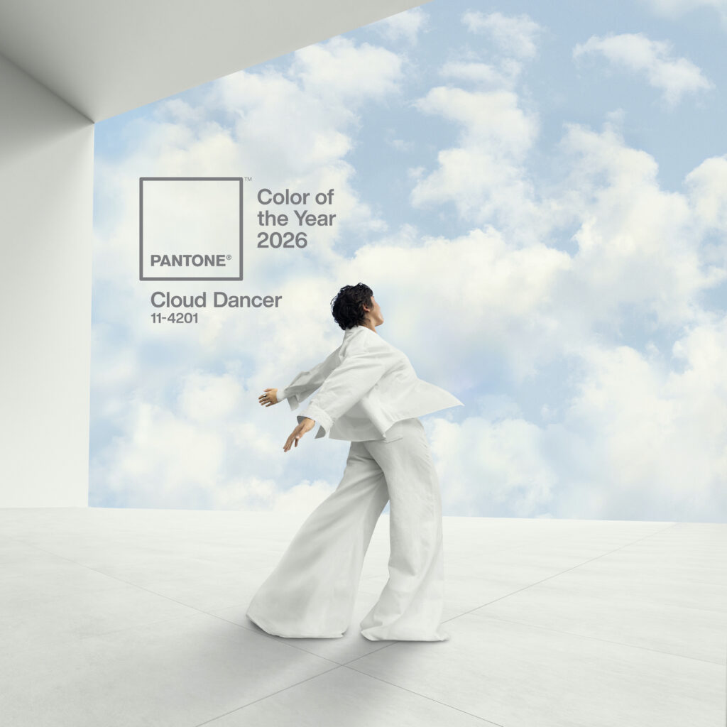
A conceptual image introducing Pantone's 2026 Color of the Year, Cloud Dancer. A woman in a flowing garments of a tranquil shade moves gracefully. She is posed as if dancing or floating effortlessly between wispy clouds and a smooth, reflective white floor. The overall scene evokes a feeling of lightness, calm, and ethereal movement.

Pantone: Cloud Dancer


Pantone has selected PANTONE 11-4201 Cloud Dancer, a serene, billowy white, as its 2026 Colour of the Year. Described as an ethereal hue, it symbolises a calming influence and a desire for a fresh start, encouraging quiet reflection and creativity.

The colour represents a conscious step away from relentless demands, promoting rest, focus, and an aspiration for peace and unity. Pantone will also spotlight artists throughout the year to create their own interpretations of the colour.

From the official release:

“At this time of transformation, when we are reimagining our future and our place in the world, PANTONE 11-4201 Cloud Dancer is a discrete white hue offering a promise of clarity,” says Leatrice Eiseman, Executive Director of the Pantone Color Institute. “The cacophony that surrounds us has become overwhelming, making it harder to hear the voices of our inner selves. A conscious statement of simplification, Cloud Dancer enhances our focus, providing release from the distraction of external influences.”

“We are living in a transitional time where people are seeking truth, possibility, and a new way of living,” added Laurie Pressman, Vice President of the Pantone Color Institute. “PANTONE 11-4201 Cloud Dancer is an airy white hue that exemplifies our search for balance between our digital future and our primal need for human connection—a liminal space that is a launchpad for creative expression—as individuals and communities are experimenting beyond traditional boundaries, opening the door to increased imagination and innovation.”

Cloud Dancer: applications of the colour of the year 2026


Far from being a “non-colour”, Pantone positions Cloud Dancer as a foundational and highly functional shade. Its key roles are to:

  • Act as a structural colour that scaffolds and harmonises the wider spectrum.
  • Provide adaptability, creating both serene monochrome looks and striking contrasts.
  • Bring an airy lightness to any product or environment.

Cloud Dancer in apparel


In fashion, Cloud Dancer serves multiple purposes:

  • A wardrobe anchor: it is the perfect, understated base for monochromatic dressing, from classic shirts and jeans to activewear and suiting.
  • A textural statement: the colour evokes billowy softness through spongy, puffy silhouettes, oversized padding, and rounded, cocooning shapes. It is realised in textures like:
    • Down- or foam-filled cloths
    • Fluffy furs and plush wools
  • An airy counterpoint: its vapour-like quality also lends itself to diaphanous chiffons and fluid jerseys, creating floaty, versatile pieces.
  • The ultimate support: it mixes effortlessly with all other colours, providing a sophisticated contrast that lets brighter hues stand out.

Cloud Dancer in fashion accessories & footwear


For accessories, Cloud Dancer introduces modernity and quiet elegance:

  • Universal compatibility: it mixes effortlessly with every colour palette, adding sophistication without overpowering an ensemble.
  • Dual textural impact:
    • In soft accessories like chunky knits and natural fibres, it offers comforting, conforming textures.
    • In structured pieces like fine jewellery, eyewear, belts, handbags, and footwear, it provides an understated, modern sophistication.

The controversy


The choice of Cloud Dancer has generated significant debate for several key reasons:

  • An unexpected letdown: after a series of bold, vibrant selections, many felt a neutral white was a surprisingly passive and uninspiring choice.
  • Perceived insensitivity: some critics viewed the promotion of a white hue as tone-deaf, given the current global discourse on racial justice.
  • A “non-colour”: public reaction was swift, with the shade widely described online as “bleak,” “dystopian,” and a signal of creative or economic recession.
  • Seen as provocation: some commentators suggested the selection was deliberate “rage bait”—a controversial move designed to generate publicity through outrage.

Pantone’s defence


In contrast, Pantone frames Cloud Dancer as a purposeful and meaningful response to the current moment. The Pantone Colour Institute describes it as a “billowy, balanced white” intended to symbolise calm, clarity, and a blank slate.

Laurie Pressman, Vice President of the Pantone Color Institute, elaborated:

“Similar to a blank canvas, Cloud Dancer signifies our desire for a fresh start. Peeling away layers of outmoded thinking, we open the door to new approaches. An airy white hue, Cloud Dancer opens space for creativity and allows bold ideas to emerge.”

A different perspective


This defence raises a compelling counterpoint to the accusations of creative bankruptcy. We would argue the opposite: how can a blank canvas represent a lack of creativity? It is, after all, the foundational starting point for every painter—the very space where bold ideas are born, and innovation begins.

Final thoughts


Ultimately, Cloud Dancer stands as one of Pantone’s most polarising choices, not just for its departure from vibrant tradition, but for its profound and perhaps unintended resonance with contemporary social currents.

A colour, after all, is a mirror. One sees in it what one brings: culture, context, and personal sensibility. While another neutral — black — might have felt more attuned to the current global climate, it lacks the essential quality of hope.

And in the end, isn’t that what we’re all looking for? Not a colour that reflects the weight of the now, but one that makes space for what comes next.

Cloud Dancer: Pantone’s most controversial colour yet Read More »

Sisyphus’ seventh season — emerging fashion brands in today’s landscape

Reading Time: 4 minutes

JAMPROOF in Milan and the slow logic of resistance


Today, we share JAMPROOF’s reflection on their Sisyphus’ seventh season — a story about today’s landscape for emerging fashion brands and independent designers. We discovered the brand at White Milano and felt their narrative of persistence and slow-making deserved to be heard.

JAMPROOF: an emerging fashion brand at White Milano


On September 25, in Milan, the stone was pushed uphill once again.

It was JAMPROOF’s seventh collection, and also our first.
Our first attempt to step into Europe. Our first conscious plunge into the eye of the storm. From Tokyo Fashion Week in March to White Milano in September, we climbed the hill twice, each time from silence to signal. No one promised success, and no summit ever waits.

Born during the pandemic, JAMPROOF has always existed against the odds.
While the global fashion industry shrank and speculation collapsed, we kept working, thread by thread, season by season.
In China, we built a retail ecosystem from scratch. But this year, we tested something larger. Something harder to move.

A glimpse of JAMPROOF's exhibition space at White Milano, showcasing clothing and design details within a curated section of emerging fashion brands.
JAMPROOF at White Milano – Sept. 25

A silent jury in Tokyo


March, Tokyo. Our first time outside China. A chance to align with another kind of Eastern sensibility.
Japanese buyers were quiet, composed. They came with notebooks, cameras, and a few words. They observed like scientists in a controlled experiment.

Some art students stopped at our coats and said, “Very Yohji.”
Some senior buyers admired the exposed stitchwork inspired by Chinese bookbinding. They gave no clear answers, but we knew we’d been seen.

Three months later, we closed a deal with a Shibuya department store. It was modest, but solid. A small set of classics on the rack.
A quiet summit.
Then the stone slipped again.

A system of speed vs. the pace of making


Emerging fashion brands rarely fail because of creativity. They fail because they run out of breath. This system demands speed: release, refresh, discount, and repeat.
Some platforms once promised a haven for independent brands, a place for Gen Z to hunt for niche pieces. But they, too, drowned in their own discount logic.

Creative time doesn’t obey seasons. But the market enforces the quarter.
“Do we need this many styles?” we often ask ourselves.
“Does the world really need this many clothes?”

We keep recalibrating, testing our balance on the scale. What makes a brand “mature”? When does persistence become coherence?

Milan: the start of something Sisyphean


At White Milano, we brought our SS26 collection, the Chants of Sirens:
plant-dyed fabrics, organic materials, richly textured Italian textiles, a hybrid of Eastern aesthetic and Western tailoring. Even our hangtags were hand-sewn from Japanese washi. They hung quietly, waiting to be understood.

Buyers came. “Bellissimo,” they said. They touched, photographed, took notes. There was excitement in the air.
But then came the silence.
They flipped the tags and paused. Our prices, shaped by small batch production and hand-finished techniques, made them hesitate. They asked about logistics, lead time, and customs. What they really asked was: can these pieces sell out within three months?

We explained: we don’t work by seasons. Our SS23 is still selling. They are not dead stocks; they are still finding their people.
They nodded. Then walked away.
The system no longer waits. Not for ideas. Not for clothes.

The slow logic of value


October. Our inbox was filled with pitches, pop-up offers, showroom ads, more platforms selling the dream of scale. But very few real buyer responses. The same refrains: misaligned positioning, budget cuts, economic slowdown, and more time to be examined.

So the stone rolls back again. Sisyphus lowers his head, reaches out, and starts over.

This is not a loud rebellion. It’s a quiet insistence.
Designer brands live in constant tension:
Protecting creative integrity while surrendering to commercial timelines.
Resisting discount culture while navigating the demand for “affordability.”
Making slow, honest work while running fast enough not to disappear.

We don’t reject the logic of fashion. We’re simply choosing to speak with it differently.
We believe that patience, restraint, and mindful consumption aren’t outdated; they’re just under-articulated.

Spending less on more is wasteful.
Spending more on something made to last isn’t indulgence; it might just be clarity.

We are building toward that clarity, one collection at a time.

The seventh, the first


This is our seventh season, and also our first.
Not the first collection, but the first act of will. The first time we chose to climb again.

Sisyphus pushes the stone uphill again. It falls. Again.
The light is still at the summit.
And for a brief second, he looks up.

✍️ Consti Gao, co-founder of JAMPROOF, writing from Beijing.

Sisyphus’ seventh season — emerging fashion brands in today’s landscape Read More »

13 more brands under investigation in Milan for labour exploitation

Reading Time: 5 minutes

A crisis for the fashion industry, or a reflection of the economic system at large?


Authorities in Milan are cracking down on labour exploitation in the fashion supply chain, placing 13 more brands under investigation after a major operation revealed severe irregularities. A sweeping inquiry has uncovered new allegations of abusive conditions linked to several manufacturers, prompting prosecutors to widen the scope of the probe. The Milan Prosecutor’s Office has now demanded documentation from 13 major fashion brands to demonstrate their compliance with labour and safety laws. Garments tied to these companies were discovered in warehouses run by Chinese subcontractors, leading investigators to call for deeper scrutiny.

From D&G and Prada to Adidas, Versace, and Gucci, the Milan Prosecutor’s Office has sent documentation requests to verify compliance with safety and legal controls.

But is labour exploitation unique to fashion, and to Italy, or is it a feature of the economic system itself?

The Milan probe: fashion & illegal hiring


Once again, the fashion industry is in the spotlight. Another 13 major groups have come under the scrutiny of Milan prosecutors. Late on Tuesday, 2 December, labour protection officers of the Carabinieri, under the mandate of Prosecutor Paolo Storari, carried out raids at corporate offices, demanding documents proving that safety and legal compliance checks had been performed along the supply chain.

Within days, the companies must provide investigators with the requested materials. Based on this documentation, the prosecutor’s office will decide whether to seek judicial oversight—under Italy’s anti-mafia legislation—or bring formal charges related to illegal labour intermediation (the so-called caporalato system) under Law 231.

Milan: 13 more brands under investigation


13 more brands under investigation — who are they?
The brands required to submit documentation include Missoni, Off-White Operating, Adidas Italy, Yves Saint Laurent Manifatture, Givenchy Italy, Ferragamo, Versace, Gucci, Pinko, Prada, Coccinelle, Dolce & Gabbana, and Alexander McQueen.

Investigations have identified cases of “Chinese migrant labour being used under conditions of severe exploitation,” with work performed “on behalf of” the brands listed. Workshops visited across Lombardy, Tuscany, and Marche revealed hazardous conditions, extremely low pay, excessive hours, and workers without contracts, protective equipment, or overtime compensation—many threatened because of their irregular immigration status.

The documentation requested from the companies is extensive: registry extracts, contracts, organisational charts, role descriptions, board minutes from January 2023, internal control system reports, supplier accreditation procedures, internal audit plans and results, monitoring and traceability plans, supplier lists, and financial statements for 2023–2024, including sustainability reports.

The prosecution appears to be urging companies to regularise their operations.

Patterns of exploitation 


This investigation is part of a broader effort to dismantle subcontracting networks marked by severe labour exploitation. Previous cases involving Alviero Martini, Armani Operations, Loro Piana, Valentino Bags, and Manifatture Dior revealed similar dynamics. Tod’s was also investigated, although judicial oversight was denied due to jurisdictional and substantive considerations.

Except for the unusual Tod’s case, interventions have not begun from direct sweatshop conditions linked to major brands. Instead, they start from the observation that checks along supply chains were insufficient or ineffective, allowing illegal practices to persist.

Judicial administration—already implemented for certain companies—aims to establish transparent supplier registries. Separately, illegal labour charges may lead to managers being held personally accountable in court.

Made in “Chitaly”: Chinese workers operating in Italy


In a post dedicated to the contradictions of 1 May 2023, we discussed “Made in Chitaly” to illustrate how the abuses seen in Rana Plaza or in the forced labour of Uyghurs in China have parallels in Italy. Thus, we see a clear, global pattern.

To preserve high profit margins, brands outsource production to Chinese-run workshops, requesting the lowest possible prices. This keeps the mythology of “Made in Italy” alive. At least for those with no understanding of quality but who seek only a famous label. Minimum wage is nowhere to be found.

Yet major publications, including Business of Fashion, frame this as an Italian issue. But is it truly confined to Italy?

From subcontracting to the system: the wider mechanism


While these cases occur in Milan, the underlying pattern is not local but global. Labour exploitation involving Italian brands may describe the immediate facts, yet the mechanism extends far beyond Italy. Opaque, multilayered subcontracting chains are deliberately structured to reduce costs through distance and deniability. Each additional layer dilutes responsibility, making it easier for major groups to claim ignorance while benefiting from lower production costs.

Fashion is not unique in this respect. The same system is at work across logistics, agriculture, electronics, beauty, automotive manufacturing, and more. Wherever cost reduction becomes the primary objective, labour is the pressure point.

The real issue: capitalism as the underlying engine


The fashion industry is now deeply entrenched in global capitalism, shaped by conglomerates such as LVMH, Kering, and Richemont, as well as private equity. In fact, luxury giants and shareholder rule. Publicly traded empires prioritise profit margins, scalability, and acquisitions. Fashion is no longer about creativity—it is a financial asset.

Let’s be direct: sweatshops and fashion are connected, but fashion did not invent exploitation. It merely mirrors the logic of the economic system that governs it. What we see in these investigations is not an isolated malfunction but a structural feature of capitalism: extraction, exploitation, and the relentless pursuit of cheaper labour.

There is no fully ethical business under capitalism—only degrees of complicity.

We suggest reading this post: Behind the Seams: Fashion Industry & Forced Labour

Social washing as the final disguise


As public scrutiny increases, so do corporate campaigns emphasising social responsibility. This is social washing: the social counterpart of greenwashing. Marketing narratives multiply, while evidence remains scarce. Ethical imagery obscures extractive practices. The gap between branding and reality continues to widen.

In this context, social washing becomes the final layer of the system—an effort to reassure consumers while the underlying logic remains unchanged.

Final thoughts


The expansion of the probe, with 13 more brands under investigation in the Milan area, sends a clear signal. It’s a stark warning for the industry — but will shoppers take notice, or simply shop as usual?

Yet, this is not a uniquely Italian scandal, nor a flaw specific to the fashion industry. It reflects a global economic structure that treats labour as a cost to be minimised. Social responsibility campaigns may attempt to soften the narrative, but they cannot obscure the systemic logic that produces these outcomes. Read: capitalism.

Until that logic is questioned, cases like these will continue to surface—across fashion and every other industry built on the same foundations. And everyone will just say: we didn’t know…

13 more brands under investigation in Milan for labour exploitation Read More »

Frankenstein, misquoted: Guillermo del Toro, patriarchy strikes at the end

Reading Time: 4 minutes

Mary Shelley: when the genius of a woman is still rewritten by men


I watched Guillermo del Toro’s Frankenstein, and what comes to mind is: misquoted. As well-made as the film is, I’m left with a strong sense of disappointment.

To understand why, let’s go back to the origin.
The birth of Frankenstein dates back to the summer of 1816, a cold and dark summer marked by volcanic ash. At Villa Diodati in Switzerland, Lord Byron challenged Polidori, Percy Shelley, and the eighteen-year-old Mary Shelley to write a ghost story. Byron soon abandoned his tale, but Mary, after a sleepless night and discussions about electricity and galvanism, had a vision: a man bent over an inanimate creature that stirred to life with a jolt. From that image came a novel that would redefine Gothic literature, horror, and science fiction, exploring ethics, creation, and fears of technological progress.

Gothic scene: An antique copy of Frankenstein by Mary Shelley rests on a weathered wooden desk, alongside a candelabra, an old leather-bound book, an ornate key, parchment sheets, and an inkwell with nib. A deep bordeaux curtain drapes to the side, framing a large, atmospheric window in the background.
“Frankenstein” by Mary Shelley — special edition, a gift from author Rima Jbara.
Frankenstein: Guillermo Del Toro’s adaptation

You read a book and take from it what you want. If you’re an artist or a director, you tell the story in your own way; art must be free to express itself. In fact, films almost never reproduce the plot of the books they draw inspiration from. Spoiler: books are always better than the films. It couldn’t be any different for Guillermo del Toro and his version of Frankenstein. The actors are excellent, their performances flawless. The set design, costumes, and music are all beautifully crafted.
The first part of the film is his own embroidery on the story: there are connections, but the real tale is something else entirely. It becomes more truthful when the creature’s narration begins. Certainly, one strength of the film is that it makes clear—even to those who have never opened the book—that Frankenstein is the name of the creator, not the creature. And above all, that the real monster is not the creature but the one who made it.
At the end, a quotation appears. As I read it, I miss the author’s name.
Beautiful, I think. I don’t recall reading it in the book. Indeed, it’s not there.

“The heart will break and yet brokenly live on.”  
Lord Byron, Childe Harold’s Pilgrimage

To sum up, the director makes a film based on a story written by Mary Shelley, and decides to close the film with a quote by Lord Byron! WTF!

Mary Shelley’s legacy

Mary Shelley didn’t just invent a genre; she wrote pages of extraordinary emotional power. Her words were enough. I understand that it’s an artistic choice, of course. And precisely because it is, it carries weight: every deliberate gesture says something.

Mary Shelley initially hid her identity as the author of Frankenstein. The novel was published anonymously in 1818. As a result, the public attributed it to Mary’s husband, the poet Percy Shelley, because of his literary fame. At the time, a young woman could not possibly have written something so radical and complex. Mary waited five years before reclaiming her name: she published the second edition under her own name in 1823. A deliberate act—she was asserting her authorship and resisting the scepticism surrounding female creativity.

Patriarchy at play

Today, you, director, draw inspiration from a woman who, at eighteen, wrote a masterpiece that continues to inspire readers, writers, musicians, and filmmakers… and what do you do? You end your film with a quote by Lord Byron? As if Mary Shelley hadn’t written countless lines that left a mark. As if Mary Shelley had ever needed a man to legitimise her. Seriously?

In other words, women today no longer have to publish anonymously, but legitimacy—oh—that still comes from men. I can’t wrap my head around it. Quoting Byron at the end shifts the focus from her to him. It’s a symbolic gesture, but symbols matter. Male appropriation of female genius — as a norm? Unintentional? Interpretations are open.

This mechanism is nothing new—and it’s certainly not gone. If this isn’t patriarchal culture…

I find myself wanting to apologise to you, Mary Shelley.

Sincerely,
Rosita

Frankenstein, misquoted: Guillermo del Toro, patriarchy strikes at the end Read More »

Clay dye processing: the colour of the earth

Reading Time: 3 minutes

A story of slow fashion from Japan: mud-dyeing born from the vision of Akira Aoki, founder of GoodNeighbors Shirts


Clay dye is the colour of the earth itself. This mud-dyeing process began as the vision of designer Akira Aoki, who founded a thoughtful slow-fashion brand. One that brings together fabric treatment and modern design.

We are all born from the same earth. Precisely this connection inspired the designer to capture the natural hues of the soil in a cotton shirt. Through repeated experimentation with local clay—each season lending its own character—the brand has created shirts with a uniquely natural colour and texture.

A series of GoodNeighbors Shirts laid on clay soil during the traditional Japanese mud-dyeing process, with green grass in the background.
Clay dye processing by GoodNeighbors Shirts, Japan

Clay dye: a Japanese story of earth, craft, and style


Fujioka City in Gunma Prefecture, northern Kantō, is where Akira Aoki was born and raised. Surrounded by mountains and rivers, the area is blessed with high-quality clay and pure water. For centuries, it has been a major producer of earthenware, including Haji ware, Sue ware, haniwa figurines, and roof tiles.
Fujioka roof tiles, in particular, trace their origins to the founding of Ueno Kokubunji Temple—a tradition spanning more than 1,200 years.

The region’s distinctive red clay comes from the Kantō loam layer, formed by volcanic ash from Mount Akagi and Mount Haruna. Rich in iron-bearing clay minerals, its fine particles retain moisture well and offer high permeability.

Aoki’s family moved to Fujioka during the Edo period and has farmed the land for over 400 years.
Drawing on the nutrient-rich red soil and natural groundwater from these fields, Akira—who studied dyeing and weaving at Tama Art University—hand-dyes each piece himself to create his mud-dyed products.

The special quality of mud-dyeing lies in the thick, clay-like paste mixed with groundwater. Its high iron content allows clay minerals to penetrate deep into the fibres. This process swells the yarn, smooths its edges, and enhances the fabric’s softness and texture.

The finished garment carries the beautiful, uneven colouration of the clay itself—as though gently coated in earth.

These mud-dyed products are coloured using only soil and water. No chemicals. Consequently, after dyeing, the clay returns to the earth, and the water nourishes the soil once more.

Through this deeply rooted craftsmanship, the brand aims to foster new values that connect the environment, people, and society to the future.

GoodNeighbors Shirts: shirts that breathe in Tokyo


The name GoodNeighbors means “good buddy, good neighbour.” The brand values shirts that are comfortable to wear every day, and that can be shared easily and without pretence. Its original designs draw inspiration from diverse music and art cultures, each carrying a subtle, distinctive character.

Made in Tokyo, the shirts are carefully cut with a modern silhouette; skilled artisans in the city’s older districts then complete the craft.  They are made to last, blending delicate tailoring with an effortless, relaxed feel—like a breath of fresh Tokyo air.

Final thoughts


Even in a market dominated by top brands and fast fashion, we remain committed to seeking out small, thoughtful gems. Ultimately, independent brands are where you will find considered design and more sustainable practices.

Clay dye processing avoids chemicals, and both the soil and the water return to nature after the dyeing process.

In a fashion system still ruled by speed and scale, mud-dyeing stands as a quiet act of resistance. In essence, Aoki’s work reminds us that colour can come from the earth, not chemicals; that craftsmanship can restore our connection to place; and that truly sustainable fashion begins with respect. For materials, for makers, and for the land itself.

Clay dye processing: the colour of the earth Read More »