Cloud Dancer: Pantone’s most controversial colour yet
Why Pantone’s 2026 Colour of the Year is sparking global debate — and what we’re projecting onto it
Cloud Dancer, Pantone’s soft white chosen as the 2026 Colour of the Year, is perhaps the most controversial selection in the brand’s history. Critics have dismissed it as boring, tone-deaf, or racially insensitive — a stark contrast to Pantone’s stated message of peace and new beginnings. As the first white shade chosen in 26 years, it has sparked accusations of “rage bait” and drawn unsettling cultural parallels.
Yet for us — having opened an all-white boutique in 2006 — this hue resonates deeply. It feels like home—a colour that never overpowered but elevated.
So, let’s take a closer look.
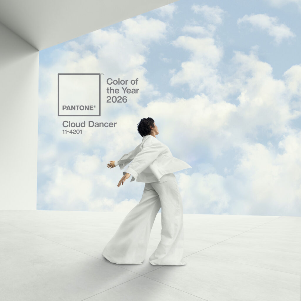
Pantone: Cloud Dancer
Pantone has selected PANTONE 11-4201 Cloud Dancer, a serene, billowy white, as its 2026 Colour of the Year. Described as an ethereal hue, it symbolises a calming influence and a desire for a fresh start, encouraging quiet reflection and creativity.
The colour represents a conscious step away from relentless demands, promoting rest, focus, and an aspiration for peace and unity. Pantone will also spotlight artists throughout the year to create their own interpretations of the colour.
From the official release:
“At this time of transformation, when we are reimagining our future and our place in the world, PANTONE 11-4201 Cloud Dancer is a discrete white hue offering a promise of clarity,” says Leatrice Eiseman, Executive Director of the Pantone Color Institute. “The cacophony that surrounds us has become overwhelming, making it harder to hear the voices of our inner selves. A conscious statement of simplification, Cloud Dancer enhances our focus, providing release from the distraction of external influences.”
“We are living in a transitional time where people are seeking truth, possibility, and a new way of living,” added Laurie Pressman, Vice President of the Pantone Color Institute. “PANTONE 11-4201 Cloud Dancer is an airy white hue that exemplifies our search for balance between our digital future and our primal need for human connection—a liminal space that is a launchpad for creative expression—as individuals and communities are experimenting beyond traditional boundaries, opening the door to increased imagination and innovation.”
Cloud Dancer: applications of the colour of the year 2026
Far from being a “non-colour”, Pantone positions Cloud Dancer as a foundational and highly functional shade. Its key roles are to:
- Act as a structural colour that scaffolds and harmonises the wider spectrum.
- Provide adaptability, creating both serene monochrome looks and striking contrasts.
- Bring an airy lightness to any product or environment.
Cloud Dancer in apparel
In fashion, Cloud Dancer serves multiple purposes:
- A wardrobe anchor: it is the perfect, understated base for monochromatic dressing, from classic shirts and jeans to activewear and suiting.
- A textural statement: the colour evokes billowy softness through spongy, puffy silhouettes, oversized padding, and rounded, cocooning shapes. It is realised in textures like:
- Down- or foam-filled cloths
- Fluffy furs and plush wools
- An airy counterpoint: its vapour-like quality also lends itself to diaphanous chiffons and fluid jerseys, creating floaty, versatile pieces.
- The ultimate support: it mixes effortlessly with all other colours, providing a sophisticated contrast that lets brighter hues stand out.
Cloud Dancer in fashion accessories & footwear
For accessories, Cloud Dancer introduces modernity and quiet elegance:
- Universal compatibility: it mixes effortlessly with every colour palette, adding sophistication without overpowering an ensemble.
- Dual textural impact:
- In soft accessories like chunky knits and natural fibres, it offers comforting, conforming textures.
- In structured pieces like fine jewellery, eyewear, belts, handbags, and footwear, it provides an understated, modern sophistication.
The controversy
The choice of Cloud Dancer has generated significant debate for several key reasons:
- An unexpected letdown: after a series of bold, vibrant selections, many felt a neutral white was a surprisingly passive and uninspiring choice.
- Perceived insensitivity: some critics viewed the promotion of a white hue as tone-deaf, given the current global discourse on racial justice.
- A “non-colour”: public reaction was swift, with the shade widely described online as “bleak,” “dystopian,” and a signal of creative or economic recession.
- Seen as provocation: some commentators suggested the selection was deliberate “rage bait”—a controversial move designed to generate publicity through outrage.
Pantone’s defence
In contrast, Pantone frames Cloud Dancer as a purposeful and meaningful response to the current moment. The Pantone Colour Institute describes it as a “billowy, balanced white” intended to symbolise calm, clarity, and a blank slate.
Laurie Pressman, Vice President of the Pantone Color Institute, elaborated:
“Similar to a blank canvas, Cloud Dancer signifies our desire for a fresh start. Peeling away layers of outmoded thinking, we open the door to new approaches. An airy white hue, Cloud Dancer opens space for creativity and allows bold ideas to emerge.”
A different perspective
This defence raises a compelling counterpoint to the accusations of creative bankruptcy. We would argue the opposite: how can a blank canvas represent a lack of creativity? It is, after all, the foundational starting point for every painter—the very space where bold ideas are born, and innovation begins.
Final thoughts
Ultimately, Cloud Dancer stands as one of Pantone’s most polarising choices, not just for its departure from vibrant tradition, but for its profound and perhaps unintended resonance with contemporary social currents.
A colour, after all, is a mirror. One sees in it what one brings: culture, context, and personal sensibility. While another neutral — black — might have felt more attuned to the current global climate, it lacks the essential quality of hope.
And in the end, isn’t that what we’re all looking for? Not a colour that reflects the weight of the now, but one that makes space for what comes next.
Cloud Dancer: Pantone’s most controversial colour yet Read More »